When your customers visit your online store, what do you think they are using as a primary device these days? Majority of people are either using a smartphone, tablet or some kind of mobile device in order to go on the web. With the increasing number of mobile devices, it has become very important to have a website with responsive design that works in a same matter across multiple platforms/devices.
Rise in the number of mobile devices
In past, the only way to access a website was a computer desktop. With the increase in number of mobile phones, the web developers initially started developing mobile websites. But, do you know that having just a specific mobile website is not enough anymore? There is a huge increase in the usage of multiple mobile devices; a website needs to be optimized for smartphones, tablets, desktops, gaming console browsers and big screen TVs etc.
Understanding Responsive Design
Before, we discuss the advantages of having an online store with a responsive design; let us understand “What is Responsive Design”? Responsive Web Design is simply a design of a website that changes its layout according to different screen sizes in order to fit the content properly when it comes to a desktop, smartphones, tablets and other mobile devices. In this definition, there is a keyword here “properly” – In this context, by “properly”, it means consistent. While working on a responsive design, the web developers have to make sure that the user experience of a website remains consistent throughout all the devices, irrespective of their screen size.
Google likes Responsive Design = Better SEO for your business website
Google highly recommends responsive design in order to target your mobile users. Google claims that the websites that offers a better user experience with the quality content and consistent user experience across multiple devices, will get preference in the search results ranking. So, if Google is recommending website owners to support responsive design, then as a business owner, you should certainly take this advice if you want your customers to be able to find your online store easily on the web.
Another benefit of supporting a responsive design is to have one single URL for your business website. There is no need to support two different URLs of your website like: “www.Domain.com” and “m.Domain.com”. Separate mobile websites usually do not get a better ranking on search engines because Googlebot user agent needs to crawl on your site multiple times with different user agents in order to retrieve the content. But, if your website supports a responsive design, Googlebot user agent only need to crawl your pages once which improves crawling efficiency that indirectly help Google index more of the site's contents and keep it alive most of the time.
Responsive Design provides a better user experience = Happy customer!!!
Responsive design delivers a better user experience and this can certainly help your business to grow. Let us take an example of a site which does not support a responsive design. What do you think a user will be doing while browsing this website? Well, the answer is quite simple but can be annoying for a lot of users: scrolling, zooming, stretching and shrinking images or text.
Responsive design solves this problem as the content of the website is automatically adjusted according to the size of the screen which makes it far more convenient for a user to browse your website on any device.
In today’s business world, if a customer arrives on your website and not able to find the desired product, there is a big chance that the customer will leave your site and head to some other website. But, if a customer had a positive buying experience on your website, the customer is likely to buy your product or services next time.
Some Interesting Facts
- 75% of Americans admit to bringing their phone to the bathroom
- 40% of shoppers consult 3 or more channels (often while shopping) before making a purchase
- 4 out of 5 consumers use smartphones to shop
- By 2014 mobile is predicted to overtake desktop Internet usage
- 70% of mobile searches lead to online action within an hour
- 78% of retailers plan to invest in mobile this year
Source: http://www.convinceandconvert.com/mobile/7-mobile-marketing-stats-that-will-blow-your-mind/
How do consumers use mobile devices to access the Web?
- 99.5% access content/information
- 63.1% access the internet
- 62.1% check email
- 49.2% listen to music
- 46% play games
- 41.7% download and use apps
- 15% make purchases
- 15% read a book
Source: http://www.engeniusweb.com/blog/mobile-exceeds-desktop-internet-usage/
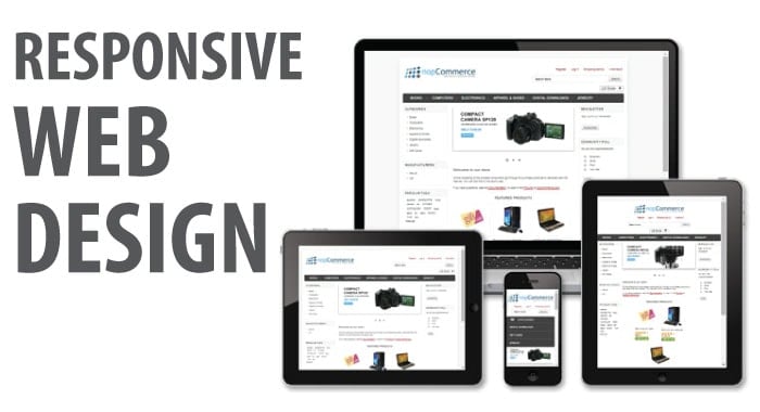
nopCommerce offers a responsive design (if enabled) that works on any mobile device, without requiring extra development or add-ons, regardless of device type. The application, which renders a device-aware shopping experience, delivers a compelling, feature rich and graphically pleasing storefront and provides a means for retailers to immediately deliver relevant offers, promotions and products to increase sales and drive business across all channels, no matter what device the consumers are using.
Author: Lavish Kumar