Today, stepping into an e-Commerce industry and launching an online store site is quite easy & fast. You can launch your e-Commerce website in just a few days and with a very limited budget. In fact, if you are using an e-Commerce solution like nopCommerce, you can have your store site up and running in less than five minutes. For many new store owners, the idea of starting an online business is an exciting experience and potentially rewarding in terms of finances.
But, in some cases the exciting experience of starting an online business can turn into an extreme frustration when sales are not meeting the expectations. Many store owners make some common mistakes by taking some crucial things for granted or do not consider taking some important actions carefully. Some store owners might have a perfect product, marketing plan and great customer service but still in some cases the sales don’t meet their expectations because they overlook the fact that the problem could be in their business website and this is what we are doing to discuss today.
Complicated and non-user friendly website
The web design industry is moving forward at a very fast pace and the trends are changing all the time. A cluttered / complicated or non-user friendly website can easily drive away the potential customers from your online store. Remember, no one wants to shop on a clunky website.
- Keep it simple and clean
Some store owners just want to display everything on their online store site from banners / advertisements to a number of buttons and forms etc. But, it is important to understand that a right proportion of content and while space keeps the users (i.e. customers) focused on the content of the site.
Too many advertisements, buttons and unnecessary login forms will only drive away your customers from the store site as they can act as obstacles in the buying process and customers can easily be overwhelmed by a cluttered layout. Remember, sometimes less is more!
- Don’t try to sell too much
It may sound like a great idea to offer a widest range of products and services on your store site to attract as much potential customers but narrowing it down to sell fewer items can easily help you focus on the targeted group of audience (i.e. customers) and help you build a strong brand. When it comes to e-Commerce business, many successful store owners will agree with these two points:
- You cannot please everyone
- It is in human nature that we all love specific solutions
So for example, let’s say you are planning to go out to dinner and really want Chinese food. Would you rather go to a restaurant that offers a wide variety of foods from different cultures (Italian, American, Greek and Chinese) or would you prefer to go to a restaurant that specializes in Chinese food only? You may like the restaurant with the variety, but you will most likely go to the Chinese food restaurant because you know their food will be the best. Similarly, with your online store, you want to be the store that people go to because they know it specializes in a specific area and are guaranteeing the best product on the market.
Limited or NO CTA (call-to-action)
A CTA is something that stands for “call to action” which means it is a button or link that asks users to engage with your website. So a link or button that says click here, download here, subscribe here. The more of these CTAs one has on their site, the better, because it transforms an ordinary person browsing your site into a potential lead for future sales.
While adding CTAs on your store site, you should keep the following things in your mind:
- Your CTA should have a clear message and eye catching
- Your CTA should be using action oriented language (like subscribe now or download here)
A few examples:
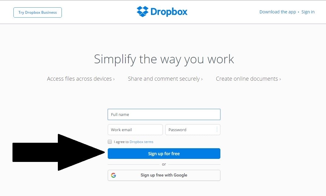
Dropbox website 
When Dropbox website was launched, since then they have always embraced a simple design that offers a lot of white spacing. Even the graphics, buttons and colors on Dropbox’s website are very simple and subtle. On the Dropbox website, a CTA is the button that says “Sign up for free”. What makes it an eye catching CTA is its color because the color of the button is the same as the color of the Dropbox logo that makes the button stands out on their homepage.
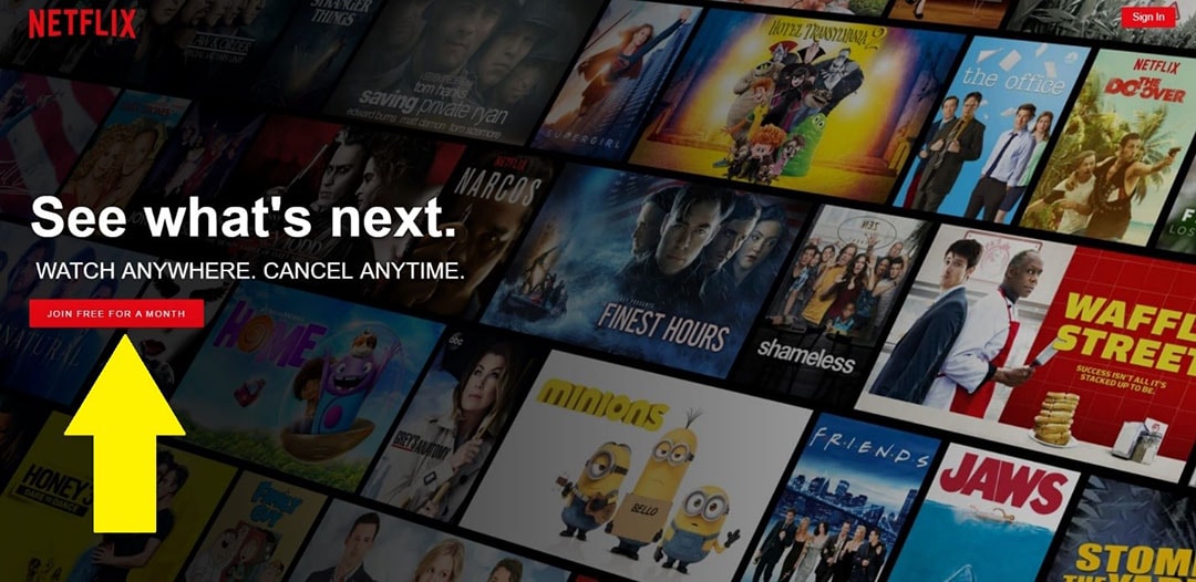
Netflix website 
Netflix is a subscription based service and when it comes to subscription, one of the most common fear in customer’s mind is that they are being signed up for a contract. Netflix is doing a great job in taking that fear out of their customer’s mind by using powerful verbiage on their homepage that clearly states that “Cancel Anytime”. Right below that verbiage is a great example of CTA button that says “Join free for a month”. Again, the button is using the same color as the Netflix logo that makes it an eye catching CTA.
Complex checkout process
Shopping cart abandonment is quite prevalent in an online business. It can be a quite frustrating for any business owner to see abandoned shopping carts on their online stores. As the customer reaches the finish line of placing an order, something barricades the checkout process that abolishes the potential sale. A confusing checkout process can easily lead to shopping cart abandonment.
- Offer speedy checkout (or one page checkout) to your customers on your store site
- Offer guest checkout option so that customers who are in hurry don’t have to spend time in filling up unnecessary registration forms
Remember, anything that requires an extra step is going to distract your customer from completing the order and it can negatively impact your sales.
Author: Lavish Kumar
Comments
Lavish, Thanks for sharing. Keep it up!