How to increase the ROI of your payment page
One of the easiest ways to tell if your eCommerce payment pages are performing successfully is if they are achieving high conversion — in other words, a good percentage of shoppers complete purchases at your checkout after adding items to their cart.
Achieving a respectable level of conversion from your payment pages can be tricky. According to a 2021 study by Baymard Institute, around three-quarters of online shopping carts are abandoned before payment, with 18% of shoppers citing an inconvenient checkout process as the reason for leaving, and 17% unwilling to hand over their card information due to a lack of trust.
So how can merchants increase trust and achieve higher conversion from their pages? In short, many of those low-performing checkouts are suffering due to poor choices — from bad design and layout decisions to a lack of payment methods or incorrect technical implementations.
In this article, we'll look at 9 payment page rules to achieve high conversion and help your checkout perform at its best.
Increasing eCommerce sales by implementing 9 checkout page principles
1. Choose the right font style and size for a payment page
Font selection can be tricky from a design perspective. On the one hand, you must ensure a unified, seamless shopping experience. That means your payment page fonts should match the rest of your website and corporate material. On the other hand, you mustn't choose unreadable fonts or pick sizes that are too small, as you risk users making more spelling errors or abandoning the page due to an inability to read the various payment fields.
2. Give attention to images and logos
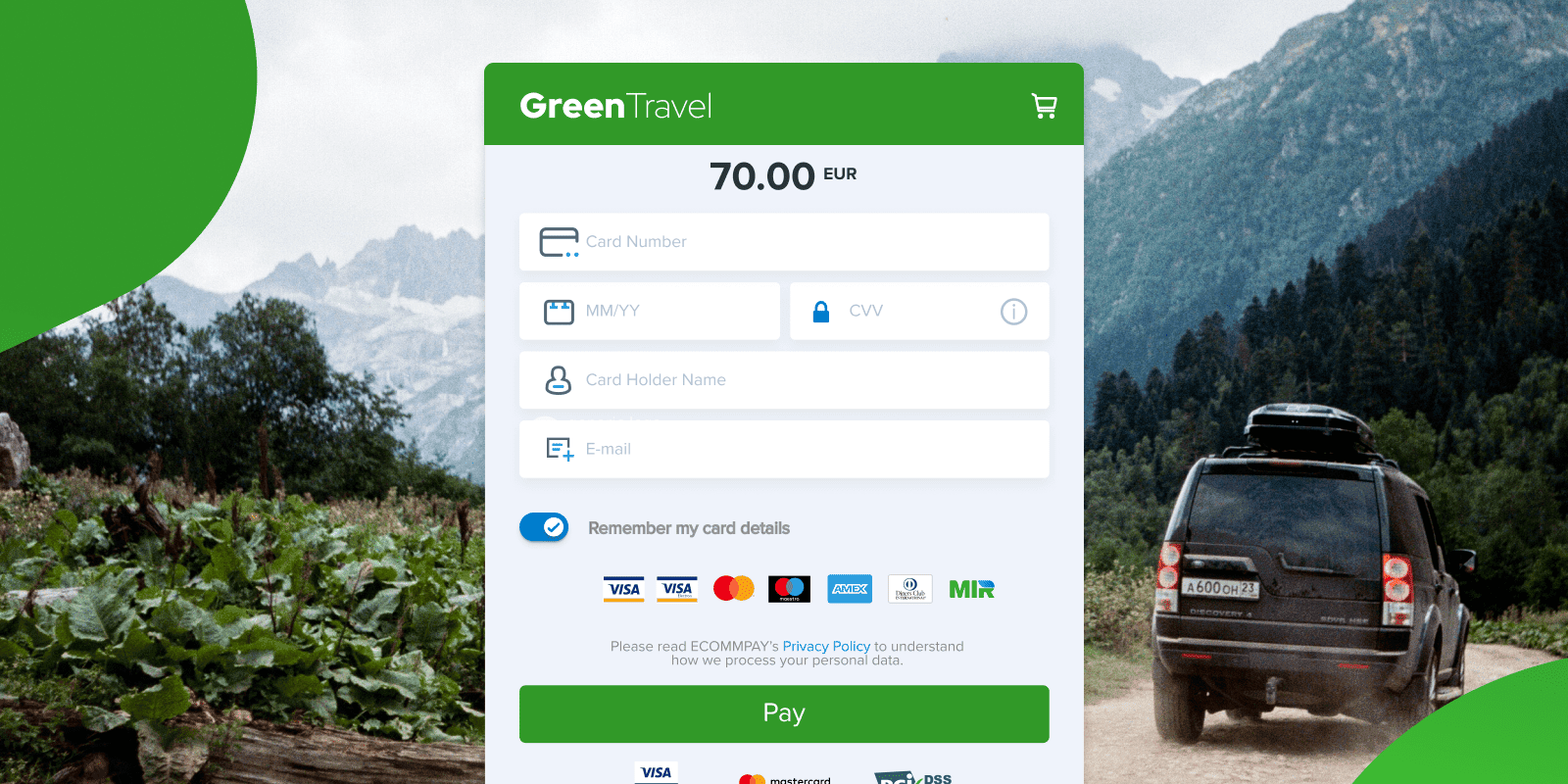
Adding your company logo to payment pages is an easy way to increase trust and helps to build a seamless payment experience. If you decide to use a background image on your payment page as well, there are several 'dos and don'ts' to consider:
Dos of adding a background image
- Do use an image that closely resembles others on your main site.
- Do make sure any logos or images match your corporate design.
Don’ts of adding a background image
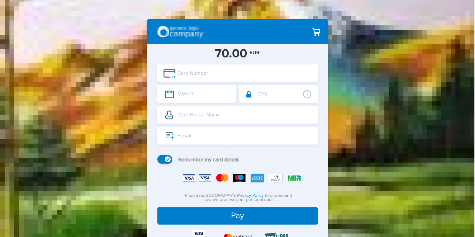
- Don't use low-quality, pixelated files — they make your site look amateurish and untrustworthy.
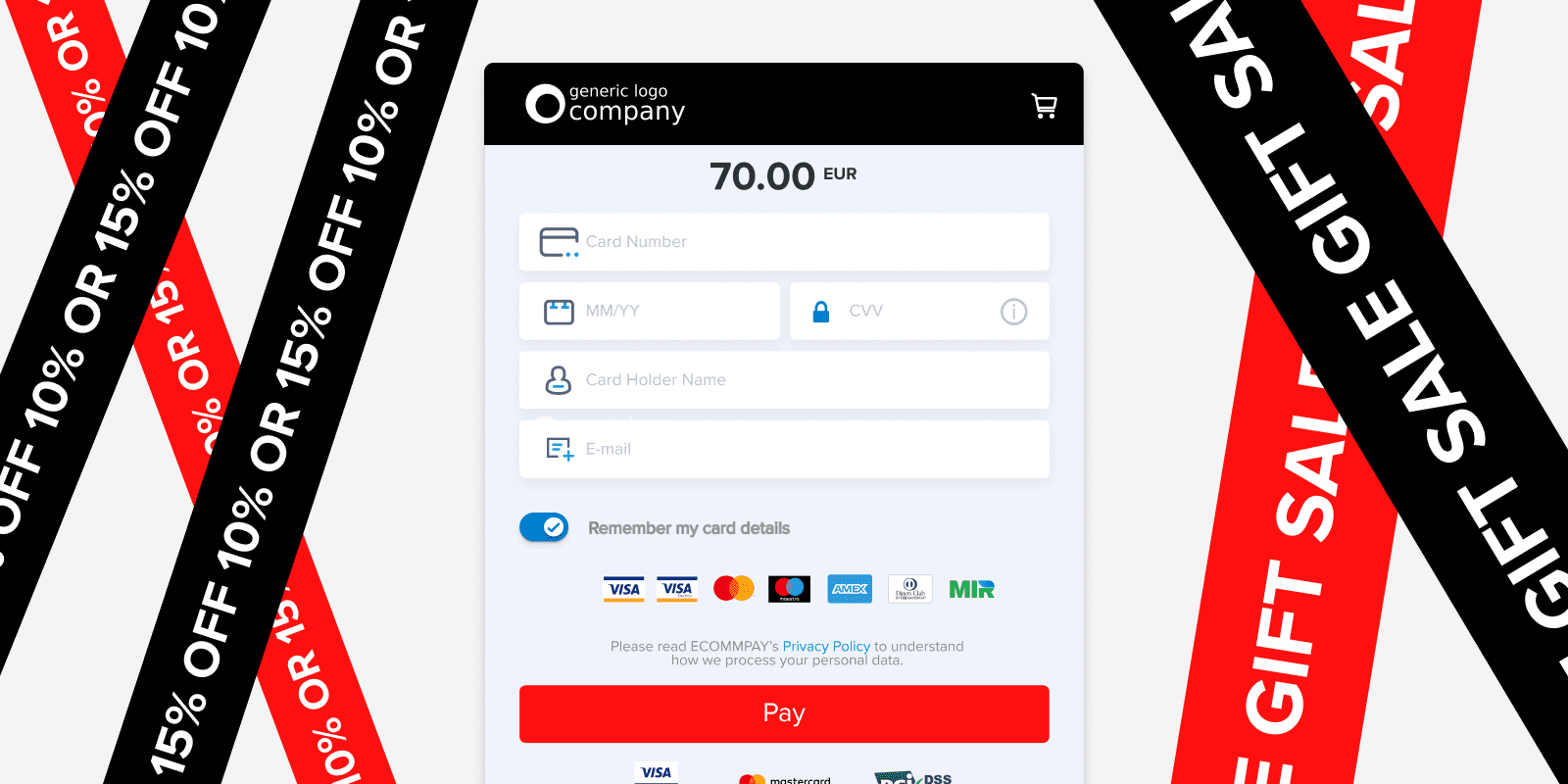
- Don't use distracting images that draw customer attention away from your payment flow.
3. Stay consistent with your color palette
Ensuring that your brand's color scheme stays consistent throughout the entire payment process is another essential element of a seamless shopping experience and helps to reinforce trust. If you're using hosted payment pages — which offer the easiest route to accepting payments online — you need to ensure that you can customize the basic color palette to match the rest of your website.
4. Add relevant security certificates and payment method logos
When designing a payment page, it's important to emphasize security to customers and to include the logos of the most popular payment methods available at the checkout, locating them to remain consistent with other online payment forms. For customers, this type of design choice looks familiar and does not require them to think twice when making a payment.
5. Help customers avoid input mistakes
If a customer has to re-enter every field after a payment fails to go through, there's a high chance they'll abandon a purchase. Customers often misspell or enter data incorrectly on payment forms, so be sure to include highlighted fields that appear when an entry has been missed or contains an error.
6. Add saved card management functionality
Repeat customers tend to convert better than new ones. To ensure that you keep returning shoppers happy, making the checkout process as smooth as possible is essential. One way of doing this is to make it simple to add saved cards to checkout for future use, but also to ensure that the card removal process has two stages in order to avoid accidental deletion.
7. Avoid iFrame embeds
iFrame (inline frame) is a method of embedding a pre-designed payment form into an existing web page. It sounds like a great way to easily integrate a checkout into a current web design, but unfortunately, it can create several issues:
- iFrame forms usually don't sit well with existing designs, lowering trust and making your pages look less professional.
- If an iFrame doesn't fit well into a page, users may have to scroll, which can lead them to abandon a page if they can't immediately see a 'Confirm' button, for example.
- Some banks don't allow the iFrame format, causing the payment processor to ask users if they agree to be forwarded to the Access Control Server (ACS). The message can appear on screen for up to 30 seconds, leading to the loss of a potential buyer.
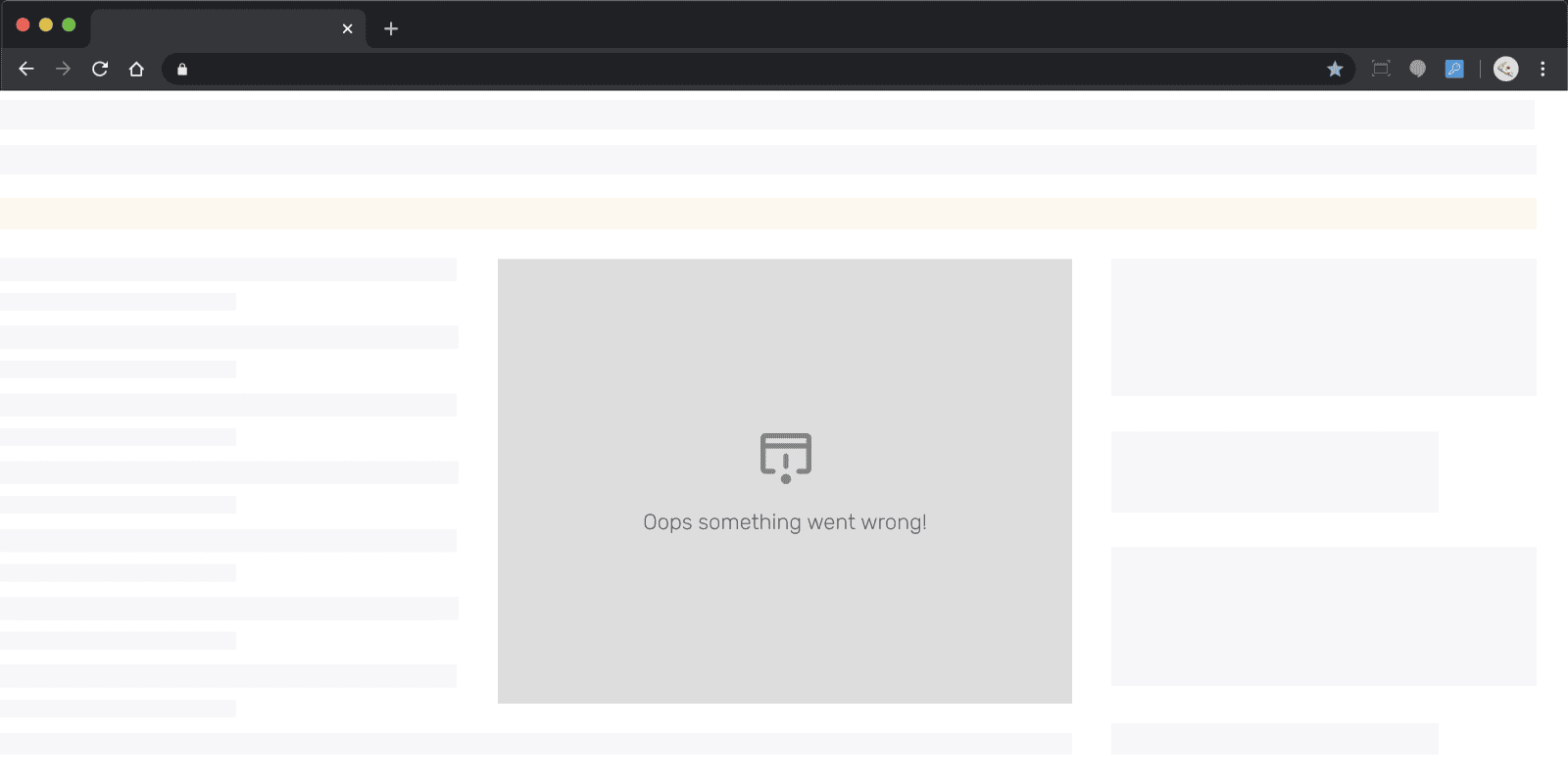
These days, there are better alternatives to iFrames for payment page integration, such as API, proxy, or redirections — though you'll need to conduct your own tests to decide which method is the best fit for your application.
8. Ensure payment pages are responsive
When everyone shopped online using desktop computers and credit cards, it was much easier to create seamless shopping experiences. Today, however, things are very different, with most customers using smartphones or tablets to buy online — as well as a significant subset who still prefer to use a laptop. To that end, ensuring your payment pages are responsive and thoroughly tested to look great on a range of devices and screen sizes is vital.
9. Offer the latest payment methods
According to a survey conducted by ECOMMPAY in collaboration with Censuswide, approximately 25% of online shoppers are ready to abandon checkout if their preferred payment method isn’t available*, so ensuring that your pages offer payment methods that your customers know and trust can help improve conversion and go a long way to avoiding shopping cart abandonment.
The same ECOMMPAY survey found that although well-known payment methods such as debit cards and PayPal remain popular (with 50% and 36% of consumers respectively likely to use them most over the next 5 years), other fintech offerings are gaining traction. Apple and Android Pay, for example, are popular among 25-34-year-olds, with 25% of the age group likely to use these smartphone-based solutions as their primary payment method.
With options such as Buy Now Pay Later also becoming popular, as well as technologies such as Open Banking now widely in use, it’s more important than ever to keep abreast of the latest payment behaviors and trends — especially if your business operates in markets where alternative local payment methods are popular.
*Insight from two surveys. One of 500 business leaders in the UK, and the second of 1,001 UK consumers (nationally representative sample). ECOMMPAY conducted the surveys in collaboration with Censuswide in March 2021.
Summing up
Developing high-converting payment pages is a tricky business, with many elements needing careful consideration to create a smooth and frictionless customer experience. Choosing an easy-to-implement solution from a reputable payment provider is often more efficient, as you'll be able to customize your pages whilst enjoying enhanced security and stability, gaining an opportunity to boost business growth in the process. That is why we recommend you rethink whether your payment provider is up to the challenge of the changing consumer payment trends.